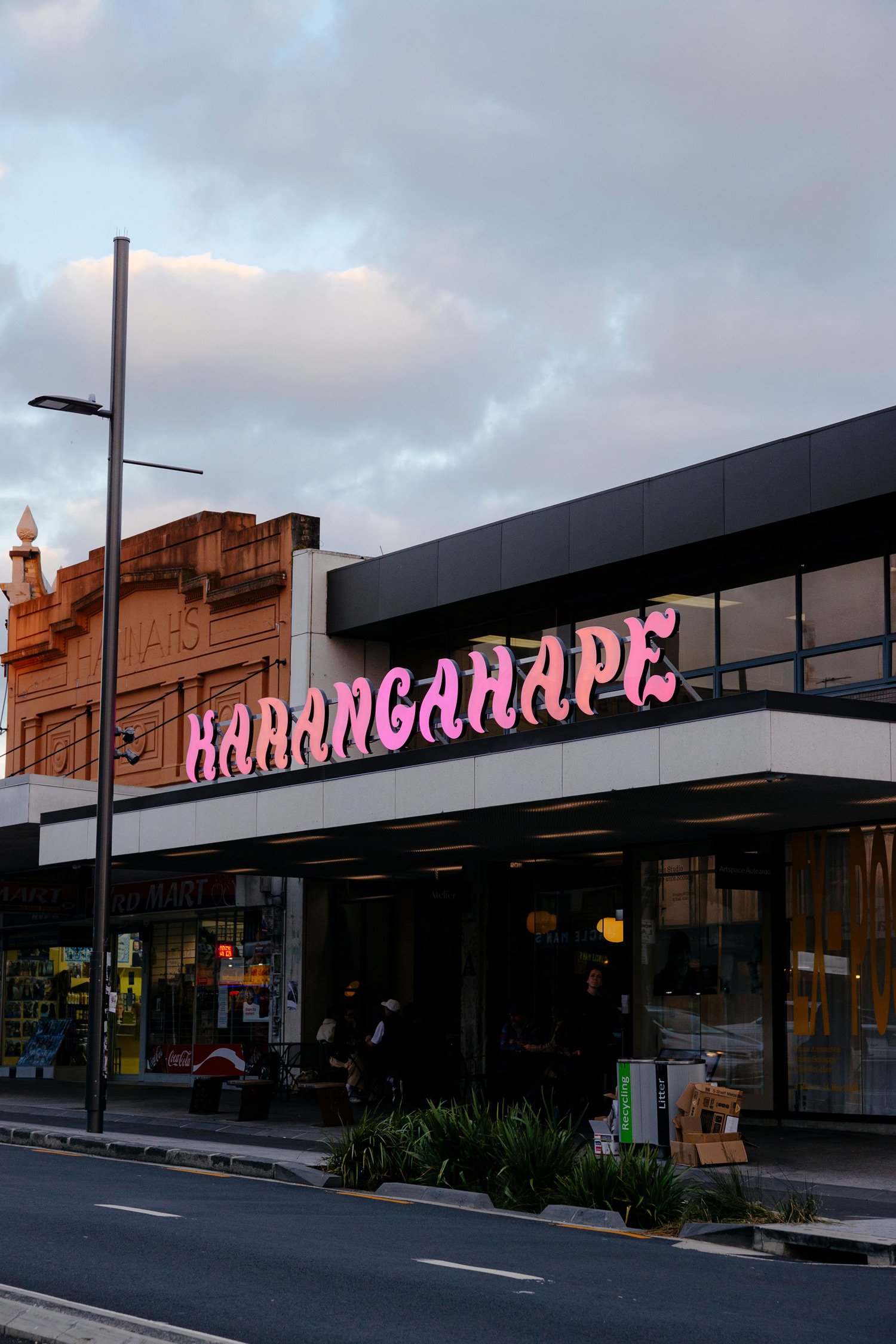


During my residency at Studio One Toi Tū I created a typeface in response to performance culture on Karangahape Road. Concepts and aesthetics in relation to burlesque and drag performance were explored as part of the research process, in collaboration with local performers. Outcomes included a usable font and an installation/exhibition piece based on the concept and form of the type specimen. 2021–2022
BOUFFONT: A typeface in response to burlesque and drag performance on Karangahape Road
Until the middle of last century Karangahape Road or Te karanga a Hape (The Place of the Calling of Hape) was the only street in central Auckland with a Māori name. The path predates European colonisation (https://www.karangahaperoad.com/heritage), so people have long walked through the night along the Karangahape ridge.
For a large part of its history Karangahape Road, colloquially known as K’ Road, has been known as a slightly seedy and gritty place. With dive bars, strip clubs, gay bars and sex workers plying their trade nestled amongst the department stores, arcades, second hand shops and boutiques, successive waves of gentrification have washed along the ridge.
The contemporary bright and poppy performance scene that thrives along K’ Road is seen generally as fun entertainment, the kind of thing you might stream or see on TV with barely a R16 rating. However at different moments in K’ Road’s history, particularly before the Homosexual Law Reform Act of 1986, the same kinds of performance would have been perceived as a lot more risqué or transgressive. This grittiness lingers a little, K’ Road still seems to attract kinds of performance that sit outside of the mainstream.
I’ve been performing on K’ Road as burlesque artist Amourous Ava for nearly a decade. Pre-COVID I performed burlesque internationally on a semi-regular basis and was (and thanks to the borders slamming shut in 2019, still am the reigning) Queen of the New Zealand Burlesque Festival. More recently I’ve also taken up performing drag as Large Hard Ron Collider. My main hustle is graphic design. I’m a self-employed creative who works mainly with typography. Typeface design is a relatively new addition to my creative practice. This project is an intersection of two worlds in which I inhabit – those of typography and performance.
I’ve noticed over years of performing that show posters tend to feature similar display typefaces, and have a recurring aesthetic. I wanted to talk to performers and producers in more depth about these design choices to understand why that might be. From these interviews/conversations I was hoping to gain insight to help me develop a typeface to offer my performer friends to use, as a response to, and a gift back to, a community that has supported me a lot over the years.
I was particularly interested in having in-depth conversations with those who both perform and produce. They often create their own marketing material and I want to understand the choices they make. I am interested in the connection between the performance works and personas that performers adopt, and the typography that is used in conjunction with performers to communicate what we do to others.
Three of the performers I had conversations with in person – Monty Montgomery, Nocturness and Nat Hugill. These conversations I’ve left in their fairly chatty and informal state as they were rather conversations between performers rather than a formal interview. Kita Mean, Kiki Kisses and photographer Peter Jennings kindly responded to my questions over email, and lastly I put a call out to performers in the wider community via online survey to seek opinions outside my own bubble.
I put a lot of the same questions to different performers as I’m particularly interested in how perspectives might be similar or differ when discussing the K’ Road performance community.
Thank you so much to all the performers who so generously gave their time and thoughtful words, and the photographers who allowed me to share their images. There are still several people I’d love to talk to and fold their perspectives into the project, this project continues to evolve and grow so the interviews will continue.
As well as studying posters from various shows that took place on K’ Road, I spent some time on K’ Road itself, looking at the typefaces moulded into the façades of the Edwardian buildings, and contemporary signage on bars and clubs.
In the book Go Girl (Go Girl, Fiona Clark, including essays by Gregory Burke, David Lyndon Brown, Blair French. Govett-Brewster Art Gallery, 2002) I found a gold mine of legacy typographic references in Fiona Clark’s images documenting the Karangahape Road performance scene. Fiona Clark kindly sent me some images of her work that included the frontage of several clubs on K’ Road in the 1970s–1980s. I was particularly inspired by the Love Tub Inn signage. It reminded me a little of iconic New Zealand typeface Churchward Marianna (by Joseph Churchward), and had a kind of balloony fun quality that reminded me of some of the shapes in drag artist Kita Mean’s costumes. I also really enjoyed the curly lettering of The Pink Pussy Cat Club, New Zealand’s first dedicated stripclub, which was in the building which is now inhabited by Starkwhite.
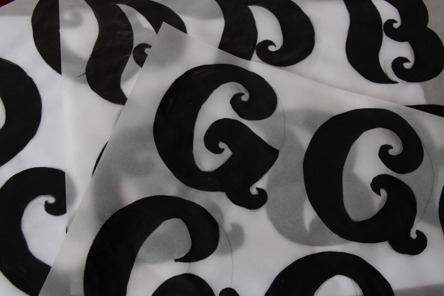
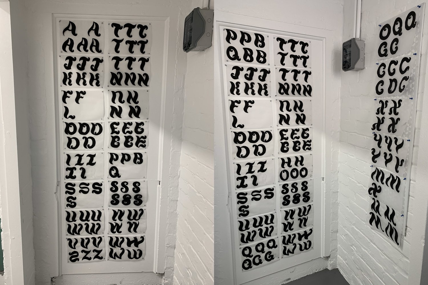
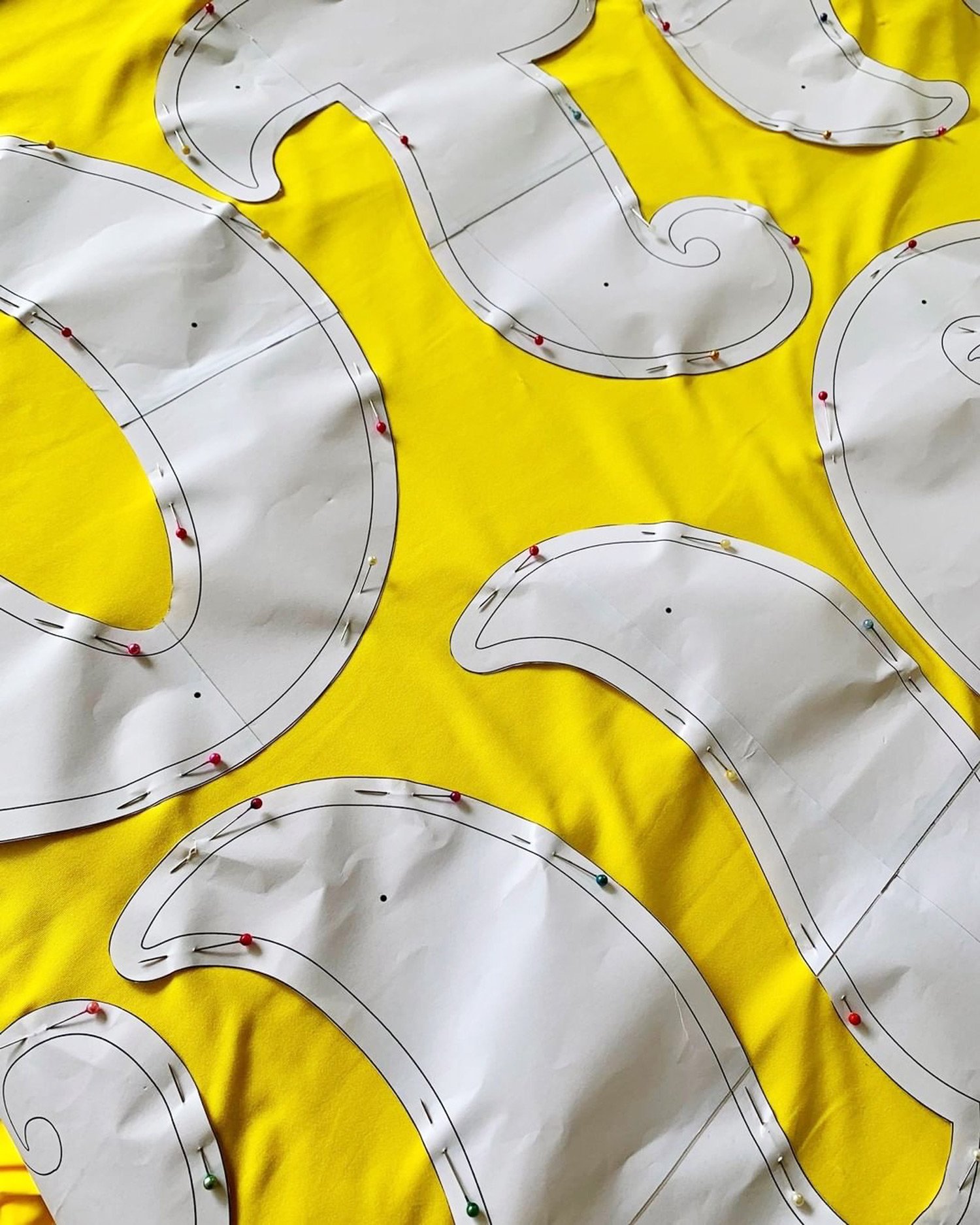
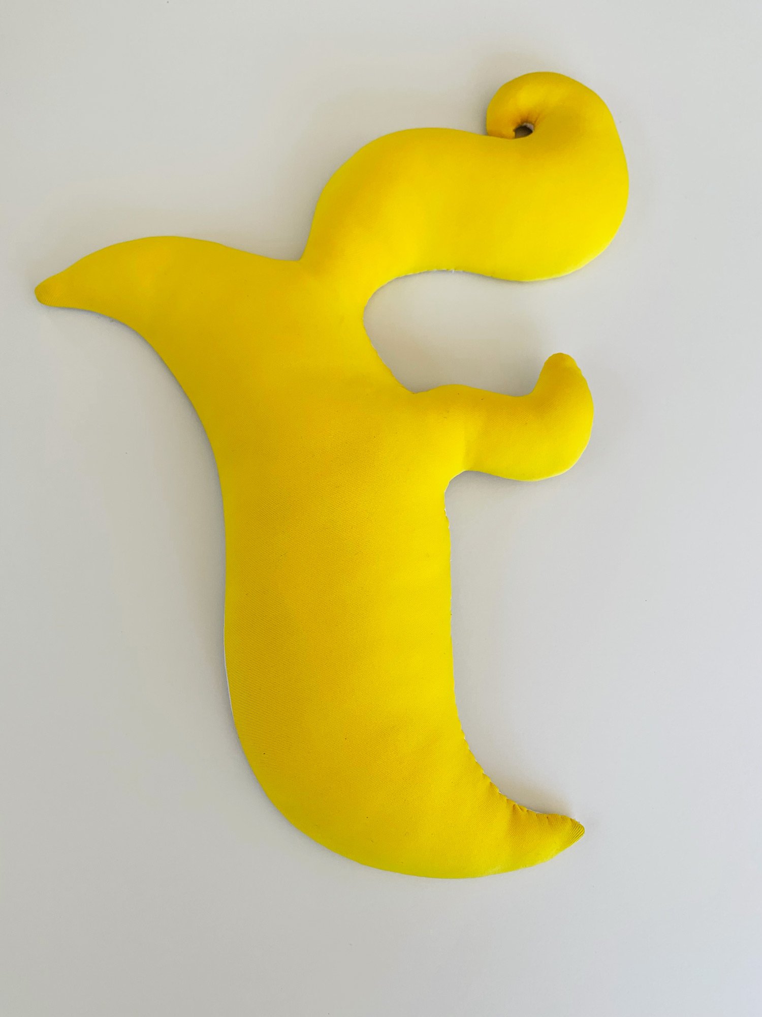
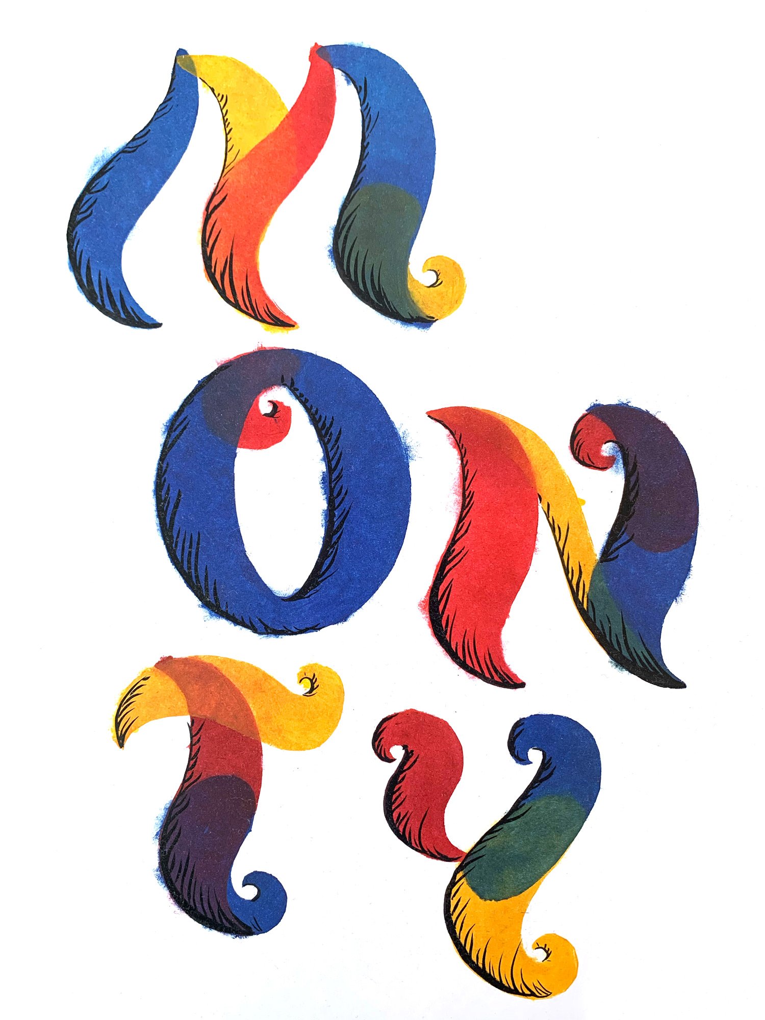
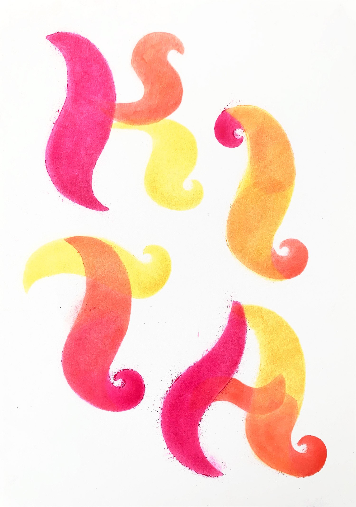
From this starting point I began to think about these shapes in association with shapes common in both burlesque and drag costumes – an accentuation of voluptuous contours, dramatic stylised swoops and curves in the wigs, and sharp sculpted flicks of eyeliner. The typeface was always going to be a display face, intended for headlines rather than large blocks of text, however it became obvious that it must be very BOLD and for mainly capitalised use. There are no straight lines in the shapes that amalgamate into letterforms. Shapes are repeated, to create rhythm and movement. The more letters that are set in unison, the more the typeface appears to be dancing. Even as I write this I realise that the typeface has also been influenced by my own performance style – it’s joyous, camp and a little bit weird.
There are as many different flavours of performance as there are performers, so this is a starting point, a response to performance on K’ Road, rather than an attempt to reduce Karangahape Road performance down to one aesthetic. Eventually this typeface will have a whole family of styles with different characteristics. As a residency project it is a work in progress, the conversations will continue, and as a typeface it will continue to be refined and grow.
It would not be possible to take on a project of this nature without leaning heavily into the puns, and as it all started with wigs, I’ve named this typeface BOUFFONT.
– Kalee Jackson / Amourous Ava / Large Hard Ron Collider
Artist Residency supported by Studio One Toi Tū
Publication supported by the Waitemata Local Board
Karangahape sign production: Angus Muir Design
Performer Type: Werkbook
Kalee Jackson
ISBN: 978-0-473-61912-1
Publication available by emailing studio@kaleejackson.com
price: $30 or free for performers