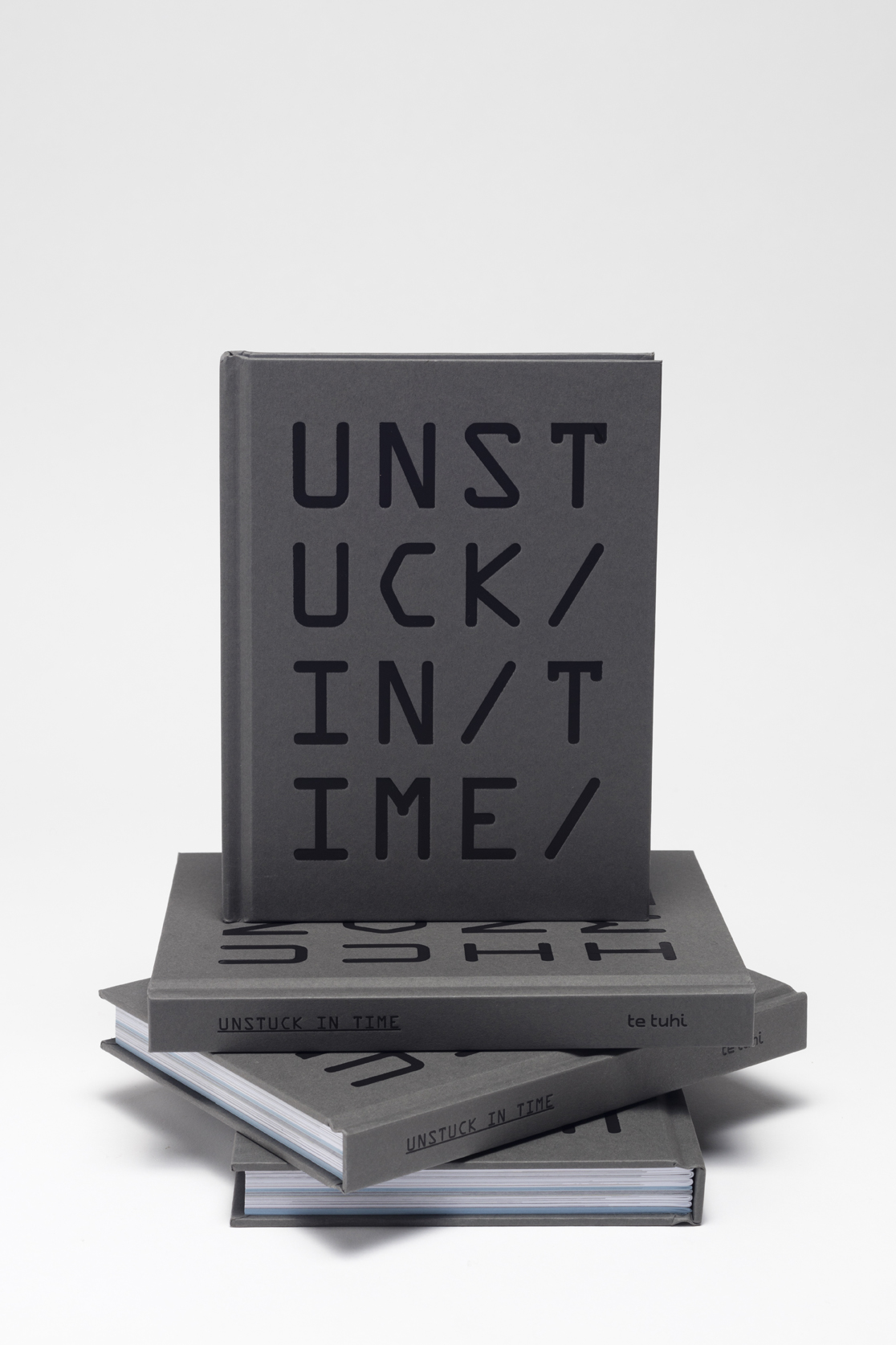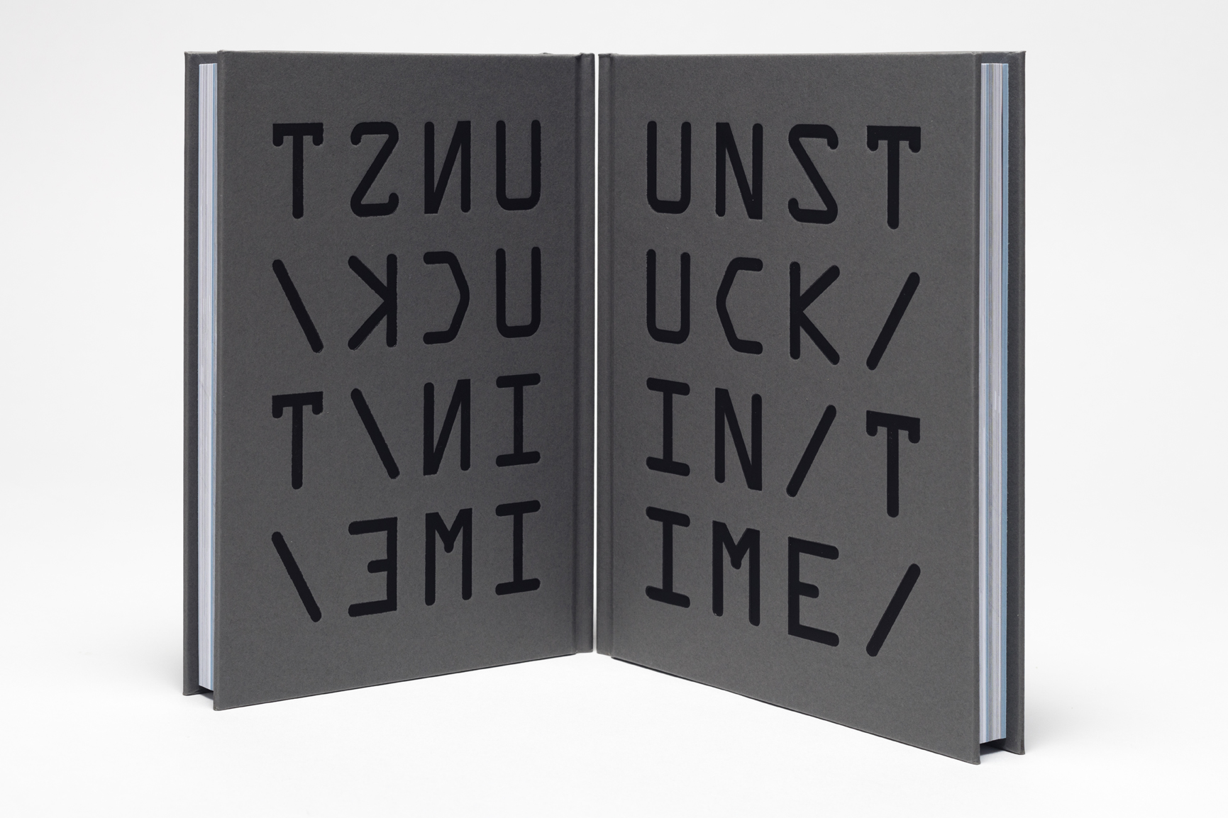
Unstuck in Time
Book design for Te Tuhi, 2015
photo by Sam Hartnett
courtesy of Te Tuhi


Much the same way as the exhibition, the typography for Unstuck in Time was inspired by sci-fi novels and film. Looking primarily at 2001: A Space Odyssey (1968) for inspiration, the timeless, modern, yet still sci-fi aesthetic of this film seemed a stylistic approach that could work well in the context of this exhibition. In 2001 Kubrick seems quite fond of Gill Sans; being also a very readable font this made it apt for the publication's typesetting. In an interesting quirk, the film's typographers had customised the font by changing the zeros, setting them in the more circular upper case‘O’. This added a more geometric, Zen flavour, and I decided it would be nerdily perfect to make the same substitution in a nod towards 2001.
OCR-A and Swiss are drawn from the film Moon (2009). OCR-A is a font that was released in 1968 and was developed for the purpose of being able to be recognised by both the computers of the day, and by humans. OCR is an acronym for Optical Character Recognition. It is a font of thick strokes that evolved almost purely out of function and appears both delightfully sci-fi and utilitarian. Sci-fi typography is characterised almost to the point of cliché by heavy-weight fonts (Eurostile Bold Extended, anyone?), so one of these seemed necessary to round out the type selection. Moon used Swiss 911 Compressed, which had the right aesthetic, but it felt too dense when used to set blocks of text, so it was substituted for the lighter Swiss 721 bold condensed.
* For a full discussion of all fonts used in Moon and 2001: A Space Odyssey I would highly recommend the blog typesetinthefuture.com