


Ruben and Hannah of Bar Martin in Mt Albert managed to work around all the COVID chaos and opened their lovely neighborhood wine bar in late 2020. They approached me to create the branding for their new business.
Hannah had found some individual hand-cut wooden ex-Auckland Council signage letters that that they really loved in Flotsam and Jetsam. We decided to use the letters as a basis for developing lettering for their branding. We’d been looking to a lot of Italian hand-lettered shop front signage for inspiration, so in developing the lettering I was keen to keep the irregularities and some of the imperfections so the logo felt comfortable and not overly formal. The branding colour is the same as the paint in the bar – Resene Shadowy Blue. You can see the original found letters in the window of their bar in Mt Albert.
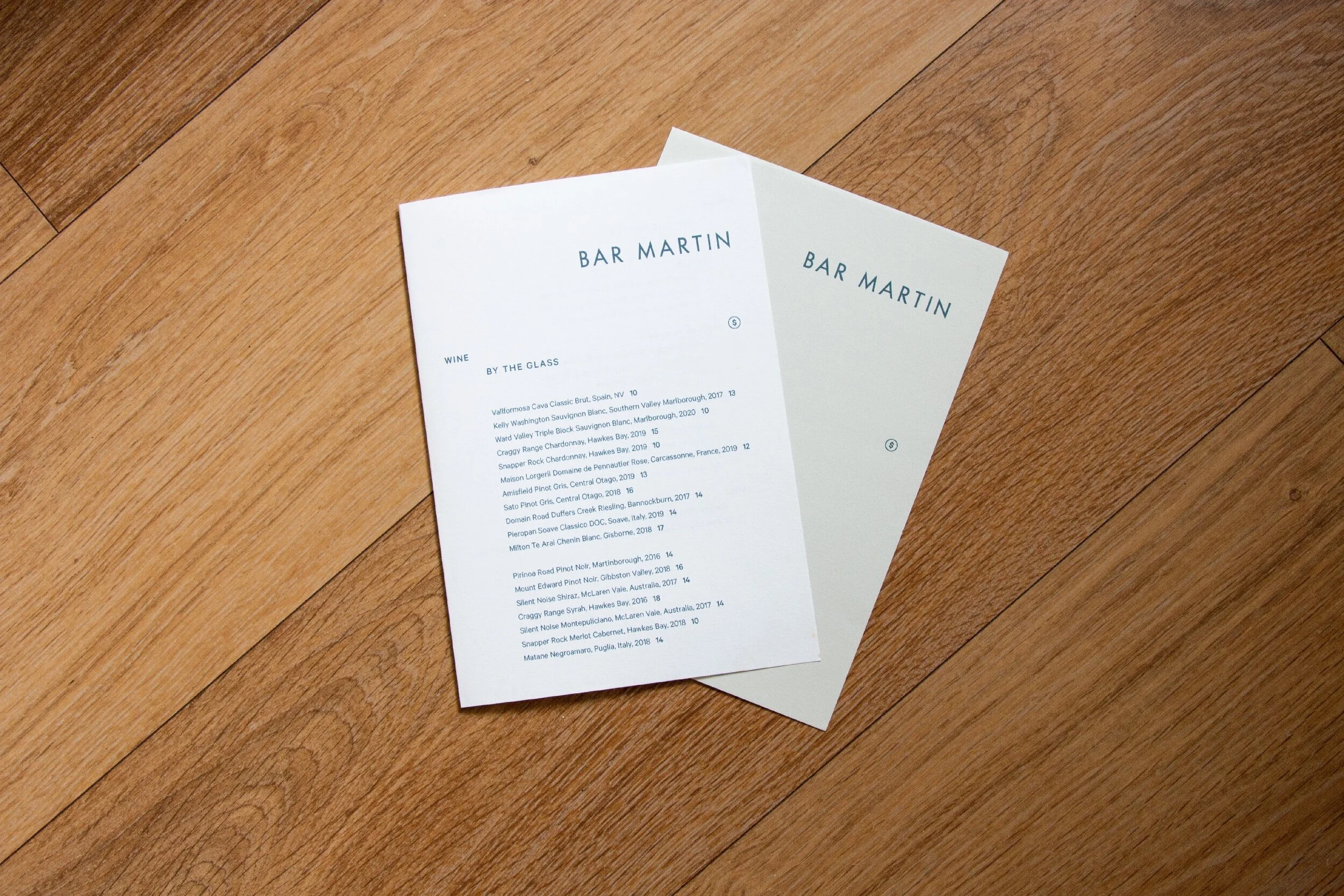
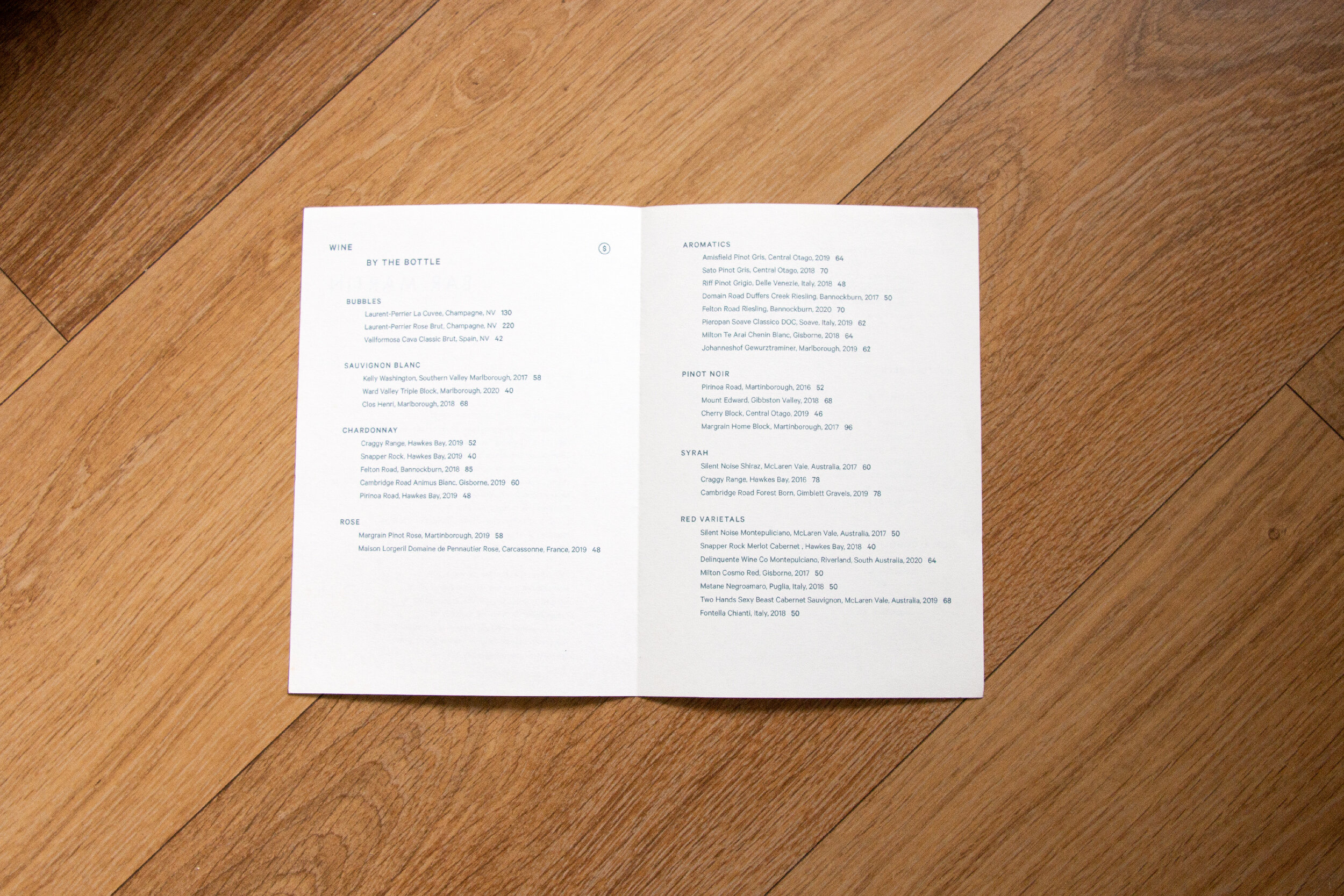
With their flexible and rapidly changing food and drinks menus, we were working with the parameters that the menu template needed to be easily updated, and able to be printed on a small inkjet printer. It also needed to be clean, contemporary, accessible, and easy to read in bar lighting.